O Marquês de Rabicó
Ilustrar uma obra do Sítio do Pica-Pau Amarelo é o sonho de quase todo ilustrador infantil. E eu realizei o meu nesta linda obra "O Marquês de Rabicó" publicada em 2025 pelas Edições IDPH.
Reimaginar estes personagens tão preciosos da cultura brasileira foi uma experiência incrível.

Os editores estiveram sempre presentes. Foi uma criação totalmente colaborativa.
Primeiro, decidimos que o estilo seria mais orgânico. Com texturas, tons pasteis e linhas irregulares.
Criamos um universo menos interferência digital, mais incerto e espontâneo, que abraça a história ambientada num sítio, longe de telas,
onde objetos ganham vida,
o real convive com a fantasia.


O design dos personagens foi a etapa mais empolgante.
Afinal, como fazer novos designs de personagens representados
inúmeras vezes por mais de 1 século?
O que eu poderia agregar com minha perspectiva e ainda mantê-los reconhecíveis?
Para começar, fiz um board com referências das mais diversas:


Ele me ajudou a decidir quais características manter, quais abandonar e como incluir meu toque pessoal nas versões.
Eis algumas decisões tomadas:
Narizinho ganhou roupas mais modernas, brasileiras e condizentes com uma menina criada no sítio — blusa de alça, shortinho e chinelo de dedo.
Seu cabelo é volumoso e irregular, preso por uma presilha de estrela que simboliza sua mente ativa e livre das convenções.
E ela é preta.
O Sítio, como obra do seu tempo, traz questões problemáticas, especialmente ligadas ao racismo.
Ter uma protagonista preta é uma forma de trazer representatividade atual e necessária..


Emília precisava parecer uma boneca, não uma pessoa fantasiada.
Por isso, tirei o nariz, mudei as proporções, coloquei bochechas remendadas, sobrancelhas costuradas e pele cor de estopa, com costuras aparentes. Nos cabelos e roupas, abandonei o clássico amarelo e vermelho.
Para manter a conexão com as outras Emílias, apostei no que a torna inesquecível: a personalidade geniosa, marrenta e desconfiada.

O meu Visconde de Sabugosa não é um homem vestido de espiga - ele é uma espiga.
Cabelos e bigode feitos de fios de milho, braços e pernas de palha, nariz de grão e, como charme final, uma pipoca fazendo as vezes de gravata.
Com Dona Benta tentei mudar o design do cabelo, mas a forma circular transmite sua personalidade maternal e acolhedora. É um abraço, um ninho.
Tia Anastácia trocou o lenço por um turbante afro, valorizando suas raízes e suavizando o estigma de serviçal.
Também renovei as roupas de Dona Benta, mais simples, para aproximar as duas personagens: menos hierarquia, mais amizade e cumplicidade.

Nos cenários, cada detalhe foi escolhido para representar a cultura brasileira de forma afetuosa:
o piso de taco, a espada de São Jorge, a cadeira de nylon.
Minha única reclamação sobre esse projeto é que não posso fazê-lo de novo.


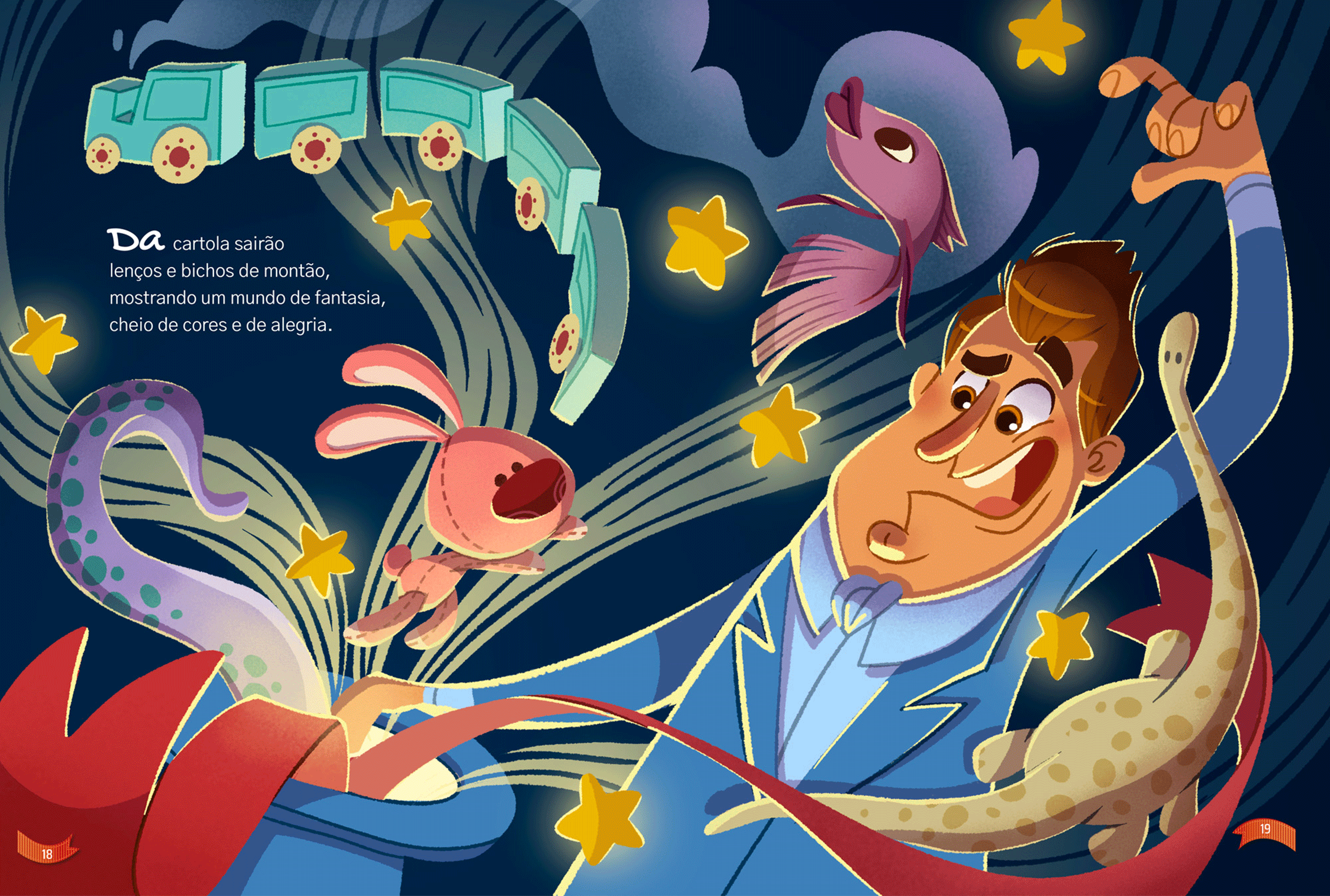
Viva o Circo
This project, published by Nucleo Publisher, aims to introduce the circus universe to kids.
Clowns, jugglers, magicians – all of them filling a world of fantasy, vibrant colors, and endless possibilities.

The only composition with a horizontal background is the first spread.
Once inside the circus, there's pure chaos and energy.

For this book, the research took weeks because the theme captivated me, and there's a wealth of material to explore!
Drawing inspiration from various sources like Dumbo (both animated and live-action), Big Fish, The Greatest Showman, along with music, books, TV shows, documentaries, video clips, paintings, and photos, was essential.
This approach allowed me to discover numerous previously overlooked details in make-up, costumes, uniforms, graphic elements, and even circus backstage and engineering.

This part of the lyrics from The Greatest Show —
"Impossible comes true, it's takin' over you, Oh, this is the greatest show"
— guides me through the sketches.

A musical broom, floating dancers, a postcard from a lion - once inside the circus, nothing is off-limits.
And the editor was totally on board with the idea!

Another interesting observation from the references is that a circus is not a full-color spectacle; in reality, it's a rather dim environment with occasional pops of color.
This insight has led to a subtle adjustment in my palette, considering my usual preference for lighter colors.

I aimed to create a vibrant, colorful universe without cluttered compositions.
So, for each spread, I chose one predominant color and its complementary hue.
As a result, the colorful experience is not just in each illustration but throughout the entire book.

O Livro do Desporto
To celebrate the 2024 Olympics, the Penguin Random House Publisher calls me to illustrate this incredible book about sports.
It was a long, and complex project in which the task was to organize a large amount of information and illustrate it in a fun way.


The more complex step was, at the same time:
to brainstorm creative solutions to illustrate the information,
to balance the amount of text with the space for the illustrations to stand out,
to ensure the text flows smoothly on the page.
Phew!
I was the happiest each time I succeeded.
It was like solving puzzles!

Noticing a pattern in the text,
I suggested a graphic pattern to creat
a more intuitive reading:
1) basic technical info under the sport's name, on the upper left;
2) a black box for the historical facts;
3) the iconic athletes depicted on stickers;
4) the "Where to find it" box in the bottom right, with a funny mascot related to the activity;
5) the background is the area where the sport takes place.


Every spread has great illustrated solutions that make the learning process easier and funnier. Here are a few of them:
 |  |  |
|---|---|---|
 |  |  |
I'm very proud of my work here and it wouldn't have been possible without the great material provided by the writer, Luís Cristóvão, and all the support and guidance of the editors. It was a great team ❤️
Health Ministry Campaign
"Kids against Zika" is one of several animations that was part of the Brazil's Federal Government Vaccination Campaign.
The graphic style
(cordel art) and the script
were predetermined.
I contributed to the
project by creating the storyboard and illustrations.


The music was composed by Zeca Baleiro, a renowned Brazilian singer/songwriter.
The animation was
produced by Hilda Motion.
Cremogema
Unilever's Cremogema is the most traditional porridge brand in Brazil. It was part of most of our childhood memories. I'm proud to have created their current mascots!


Since the desired animals were already determined, I was tasked with creating cute flat design characters.
These characters would be used across a range of products. Additionally, each character needed extra elements and activities associated with them.
Later, they introduced a new line, and we further developed the mascots with different poses.
Here are some of the sketches.

Educational Projects
I love to talk, especially about illustration. So, when amazing brands ask me to record art classes, I say "yes" in a heartbeat.
In my Domestika course, I teach how to create an illustrated book starting from the sketch (actually, starting before that).
My focus is on explaining how illustrators can express their personality and perspective through their artwork.
I had SUCH a great time!
I'm thrilled with the results and feedback. Thank you so much, Domestika Team!
Faber-Castell invited me to collaborate with them on developing a few online art classes for beginners.
I do have a long-lasting relationship with Faber-Castell. I was also part of some other videos, campaigns, social events, surveys, and projects.