O Marquês de Rabicó
Sítio do Picapau Amarelo (Yellow Woodpecker Ranch) is a fantasy book series originally published between 1920 and 1947. It is a cornerstone of Brazilian children’s literature — a work that helped shape our cultural identity and continues to resonate deeply today.
I had the chance to illustrate one of these great stories in 2025 with the beautiful book The Marquis of Rabicó (O Marquês de Rabicó), published by Edições IDPH.

Reimagining such treasured characters from Brazilian culture was an incredible experience.
The editors were always present, making it a fully collaborative creation.
We first decided the style should feel more organic — with textures, pastel tones, and irregular lines.
We wanted a universe with less digital polish, more uncertainty and spontaneity, embracing a story set on a farm, away from screens, where objects come to life and reality blends with fantasy.
Character design was the most exciting step.
After all, how do you create new designs for characters that have been represented countless times for over a century?
What could I add from my own perspective while still keeping them recognizable?
To start, I built a reference board.


It helped me decide which traits to keep, which to abandon, and how to include my personal touch in each version.
Some of the choices I made:
Lucy (Narizinho, literally “Little Nose”) no longer wears the traditional dress.
Instead, she steps into clothes that feel both modern and deeply Brazilian — a sleeveless top, shorts, and flip-flops, just right for a girl growing up on a farm.
Her hair is wild and irregular, held back by a little star-shaped clip that hints at her restless, imaginative mind — always active, never confined.
And she is Black.
As a work of its time, the Sítio carries problematic aspects, especially regarding race. Making the protagonist Black is my way of bringing much-needed, contemporary representation.


Emília needed to look like a rag doll, not a person in costume.
That’s why I removed her nose, changed her proportions, gave her patched cheeks, stitched eyebrows, and burlap-colored skin with visible seams.
For her hair and clothes, I moved away from the traditional yellow and red.
To keep her connection with all the Emílias that came before, I leaned on what makes her unforgettable: her fiery, stubborn, suspicious personality.

My Viscount of Corncob (Visconde de Sabugosa) is not a man dressed as corn — he is corn.
His hair and mustache are made of corn silk, his arms and legs of husk, his nose a kernel, and — for a final touch of charm —
a popcorn bow tie.
With Mrs. Benta (Dona Benta), I tried to redesign her hair, but the round shape conveys her maternal, nest-like personality. It is a hug, a safe place.
Aunt Anastacia (Tia Anastácia) traded the kerchief for an Afro-inspired turban, honoring her roots and softening the old maid stereotype.
I also redesigned Mrs. Benta’s clothes, making them simpler, to bring the two women closer together: less hierarchy, more friendship and complicity.

Every detail was chosen to lovingly represent Brazilian culture: parquet floors, the espada de São Jorge plant, nylon chairs.
My only complaint about this project? That I can’t do it all over again.

Storytime Magazine
My collaborations with Storytime Magazine are always both challenging and enjoyable. The stories are imaginative, filled with great characters and full of action.
In The Great Drought, the challenges were:
1) Researching and designing a cast of
exotic Australian animals;
2) Fitting all 13 creatures across both spreads + text;
3) Picking a color palette that works, despite most animals having earthy tones and living in a desert.
Challenge accepted — and conquered!
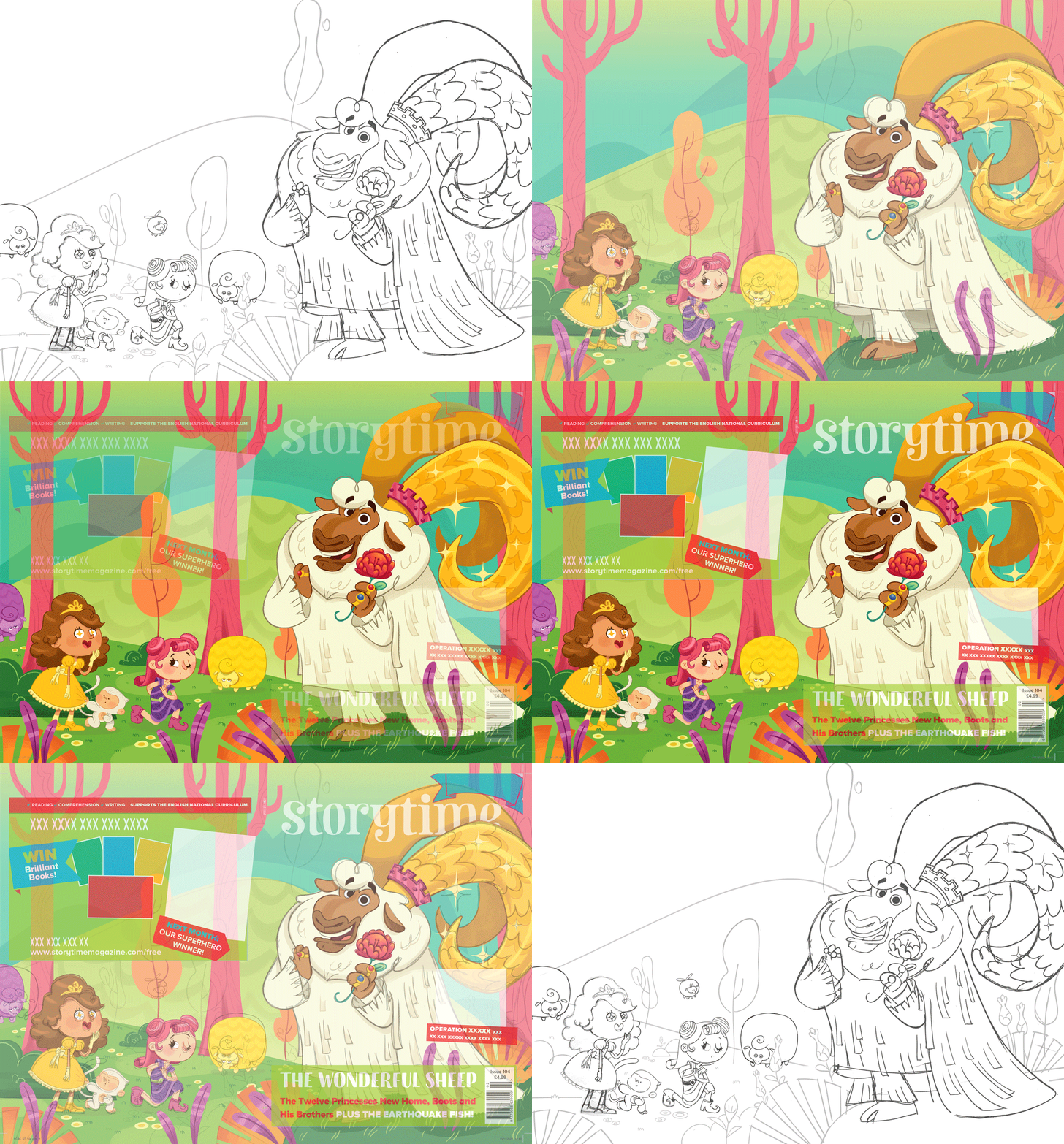
"The Wonderful Sheep" was my first cover story for them.
It was a five-spread tale about an adventurous princess who ventures
into a magical realm.
I designed the princess with curly hair, and darker skin than the servant.
I also gave her sneakers
to display a lively vibe.

What I love about short stories is that I can open a new door, peek into a new world, meet its characters, illustrate a few highlight scenes — and it’s done! No time to get bored. Unlike this toad.

The Tortoise and The Hare
In my Domestika online course, I propose this project. The goal is to inject your own perspective and personality into a classic story.
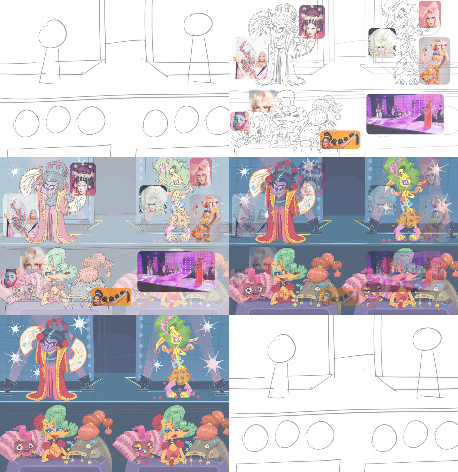
We take Aesop's "The Tortoise and the Hare," but with a personal spin. My spin? Turning it into a Drag Race extravaganza!

I start my creative process by figuring out how I can contribute to the story with my artistic style.
And when I say "artistic style," I'm not just talking about graphics but all the ideas and concepts as well.
I include queer culture with drags, add humor with lots of wordplay, and show my nationality through animals and food.


Then I check how other artists handled the same story, ensuring I bring something
new to the table.
Next, I delve into visuals—photos and illustrations—to plan character designs, balancing inspiration and avoiding too many similarities.

Now I'm ready to design the main characters.
Just enough to have an overall shape to see how they set in the composition.


Then, the thumbnails!

The next steps include:
1) gathering more references;
2) refining the sketch;
3) adding color.

For the jury, I chose only Brazilian animals - a marmoset, a pintado fish, and our beloved caramel stray dog ❤️.
The Mirror, the Carpet
and the Lemon
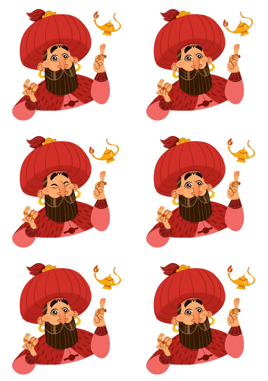
"The Mirror, the Carpet and the Lemon" is a picture book I created with Edebê Publisher, based on a famous Middle Eastern folktale.
What I liked most about this project was the decision to narrow down the focus of my research, which guided me in all my design choices.


This tale doesn't come from a specific region.
However, I didn't want to create a generic Middle Eastern universe.
I suggested to the editor that we should focus on Persian culture since the text mentions it once.
The Persian culture inspired me not just in terms of architecture, fashion, and ethnicity, but also with their art.
I like to dedicate some days just to the research. It adds more depth to the illustrations!! It's more than just telling a story, it's about showing a glimpse of a whole culture/subject.
Here are some of the results:


For the "princes from all
over the world" scene,
I aimed to portray a few variations of royalty that go beyond
the typical European ones.
The final spread
was inspired by a painting of
a traditional Persian wedding.
I made some adaptations
to ensure it remains relatable while preserving the
core elements.


